Year
2016-2019
What I did:
- Project UX Lead
- Task Flows
- Wireframes
- Research synthesis
- Art Direction
- Prototyping
- Accessibility consulting
Deliverables
- Wireframes
- Prototypes
- Dev Ready mockups
Intuitive Investor is the low-cost hybrid-robo advisor from Wells Fargo Advisors that helps you invest like an expert.
Disclaimer: Some information is left out of this case study due to confidentiality.
Overview
Some background, I worked on Intuitive Investor™ from its inception (when we sunsetted the Easy Investing Tool, its prequel) until I left the firm in early fall of 2019. There are way too many sub-projects to list here so I will just showcase the last most recent project that I led, the update design of the landing page. This was a tremendous team effort that played a part in the final outcome
Problem
Uplift the existing design, increase CTR (click through rate) into the sales funnel. Better communicate on going marketing efforts and start the transition to the new branding (phase 1: fonts and colors) with these challenge points in mind. Other evergreen UX objectives were:
- Make it more scannable
- Clearer language – less jargon
- Clarify pinpoints of confusion
- User experience more connected to personas.
Process
Landing page walk through
What I did
Starting with Research
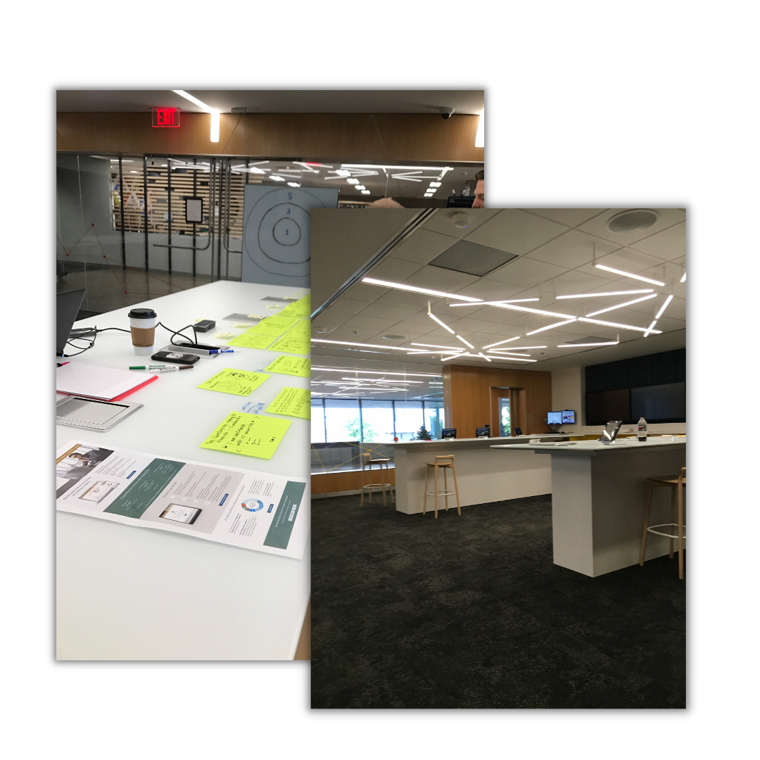
Previously, I co-facilitated a in person testing event where participants came in and did some collaborative activities. Participants were asked to triage the most important parts of the existing landing page, identify things they felt were missing, or that they thought were hard to understand.
Understanding The Problem
After synthesizing the results, I began to understand the user’s pain points and came up with these problem statements:
- How might we reduce the amount of text (and jargon) on the page?
- How might we better explain how the product works?
- How might we incentivize users to get started with the investment quiz?
- How might we simplify the experience?


Content Strategy
What I did
Kill The Jargon
- Removed as much jargon as the legal department would allow – used Hemingway app to edit copy to be easier to understand
- Updated the CTAs to be more compelling and reduce commitment anxiety
Wireframes: Rearranging The Furniture
- Simplify the experience
- Restructure the information architecture to match customer priorities
- Leverage research findings with marketing and stakeholders
Design Direction
New Branding Restrictions + Innovation
Art Direction
On the typography, we flipped the dominant and secondary font structure to give the design gravitas and maturity while still keeping it modern. With photography we wanted to:
- Curated imagery for the visual designer that created an initial first-person emotional impression
- Convey a sense of purpose
- Make the product relevant to the user (i.e. what we do is invest your money so you can come closer to doing what you like to do)


Design Iterations
Design Feedback, testing 3 core concepts.
The team and I designed 3 “straw man” concepts based on user testing results. This approach took the challenge points from different angles. Every version had elements of these takeaways: easy, smart, convenient, trustworthy.
Results & Adaptation
Testing yielded clear results in terms of which features of the designs worked the best. The overall winner was refined to incorporate those aspects. The net result was well received by stakeholders and was the team’s favorite.

Project Outcome
Unbelievable 500% CTR
Changing the language of the primary call to actions to “Sign on to begin” had a very positive outcome. The resulting spike in engagement (500% CTR) was a direct result of the changes to the design.
Intuitive Investor
This product continues to evolve; you can view their current offerings on the live site.

